Brittney Malpeli - CREATIVE DIRECTION
GROWN UP...
BUT NOT BORING.
Swapfiets started as a student brand and built its name by not taking itself too seriously.
The challenge was to grow up without losing that playful edge.
The simple brand promise that makes a big impact
WORRY-FREE BIKING
INSIGHT
Owning your own bike means you own all your bikes problems, with Swapfiets that's no longer the case.
THE IDEA
Build on what’s recognisable,
evolve the brand and reframe it as
a bike membership.
MY ROLE
Led the brand refresh, defined the identity and oversaw all output as the brand scaled.
THE REBRAND
The rebrand focused on evolution over reinvention.
The blue tire became the hero. A distinctive, recognisable asset used consistently across all touch-points. The visual language was refined to feel more confident, flexible and grown-up.
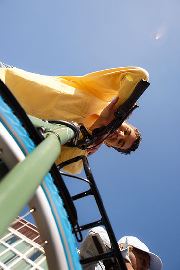
More importantly, the work shifted from explaining functional benefits to showing the feeling of worry-free biking, using storytelling and emotion to bring the brand to life.
The result was a brand that could speak to a broader audience, without losing its original charm.

THE VISUAL LANGUAGE
As Swapfiets expanded across markets and introduced new e-bikes, the brand needed to work harder.
A flexible visual language was developed to support everything from campaigns to in-store, making it easy to stay consistent while moving fast.
All grown up across every touchpoint:
CREATIVE DIRECTION | BRAND IDENTITY | ART DIRECTION | CAMPAIGNS | SOCIAL | OOH | RETAIL | POS | WEBSITE | EMAIL | CRM | BRAND GUIDELINES | TOOLKIT | IN-HOUSE STUDIO


STOP STRESSING.
START RIDING.

